Non-web environment
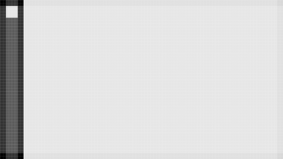
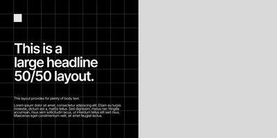
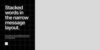
Non-web grids are based on a 20px unit. All elements are sized and spaced in multiples of 20, though which multiples depends on the particular medium. Below we have examples of grids for podcast promotion, podcast video, and 16:9 twitter layouts. These grids work for 16:9 @1920x1080, 1:1 @1920x1920 or 1080x1080, and 9:16 @1080x1920. They can also work for print in 1:2, 4:3, 1:1, and other aspect ratios.
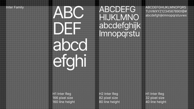
The typestack for these grids is also based in multiples of 20px, line height adjusted on type styles so that the resulting blocks neatly fit into the grid.
Logos State Podcast
2 column 20px and 4 column 20px
Hashing It Out
3 column 20px and 2 column 20px
Generic Twitter
This is a simpler grid based on 96px, used for X. Type sizes are also based on divisions of the 96px unit.

